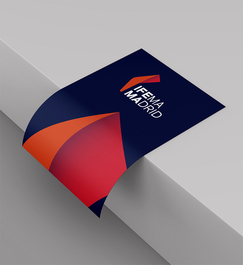
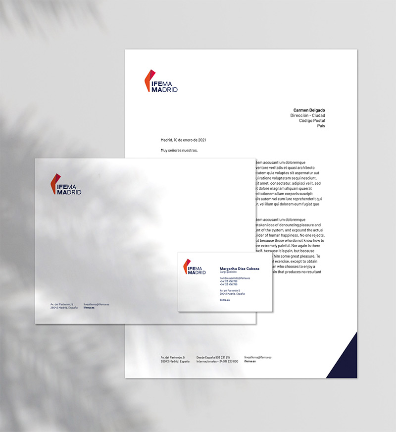
Our logo is the graphic synthesis of our strategic platform and serves as an identification of everything that represents us, generating an emotional and mobilising connection with our audiences.
The symbol projects vitality, togetherness and creativity. It represents inspiration: a look that’s open to the future.
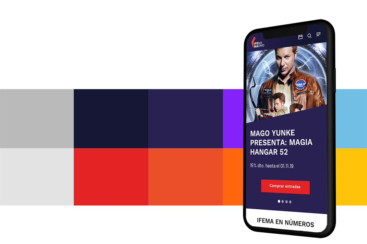

Our colours speak of our attributes
IFEMA MADRID deep blue, our main colour symbolises the essence of transformation. A colour that conveys leadership, impact and the future.
IFEMA MADRID blue, represents the ingenuity that characterises us.
IFEMA MADRID coral represents the energy and passion of the Spanish character, as well as making a nod to the colour of the Community of Madrid.
IFEMA MADRID orange projects the closest and most human side of the growth that we champion.
Our fonts
We have a new selection of fonts. Two fonts have been selected generating a visual contrast between them:
FS Meridian Bold, which provides expressiveness, and Barlow, which is more functional and legible .
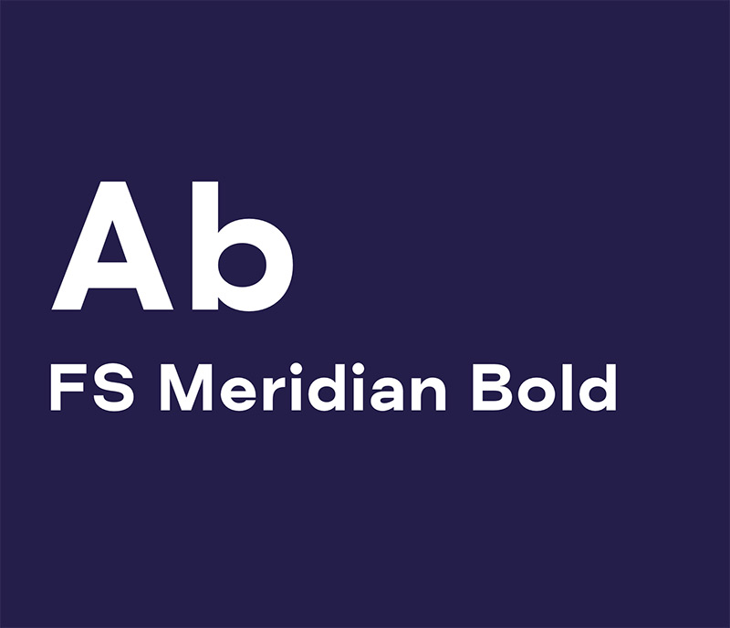
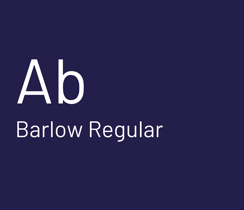
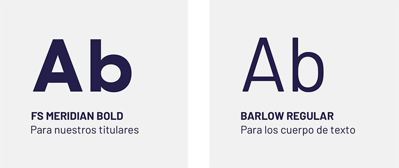
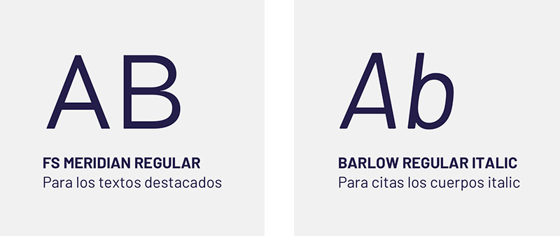
Photo style
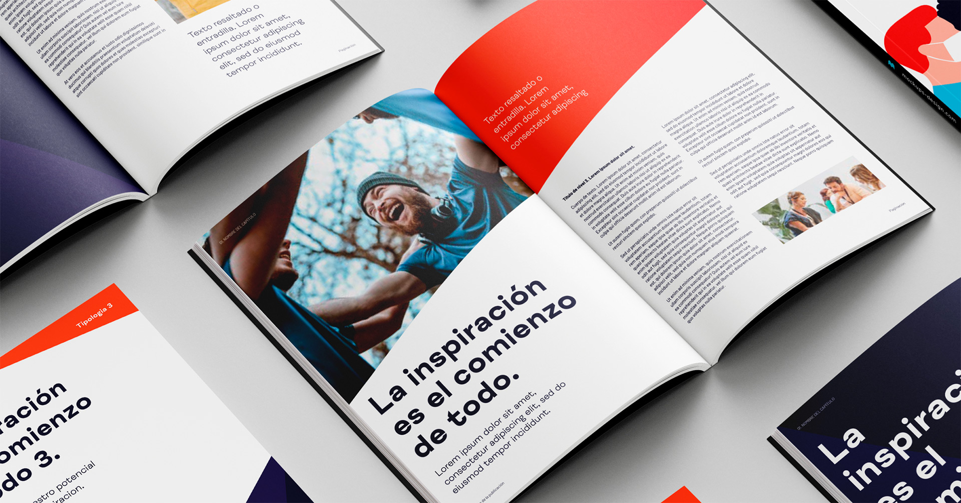
Our photographic style will help us to communicate our trajectory and reason for being, transmitting our potential as an epicentre of inspiration where everything is in constant motion.
It is unique and helps us to differentiate ourselves from others, while achieving an emotional bond with our audiences.
The photographic style conveys clarity, movement and inspiration. One of the most significant characteristics of our photography is that we have a very particular way of observing the scene.



Conveying ideas and evoking emotions
Our illustration comes from the hand of the British artist Rob Bailey, who creates magnificent illustrations with a minimalist, simple and functional geometric style, maintaining the synthetic and two-dimensional style.
The style is not limited to representing reality as we see it, but it tends to highlight the forms to reinforce ideas and evoke emotions.


A brand
very much alive
This is how our
IFEMA MADRID madrid sounds
Our brand is not only seen, it is also heard. In addition to all the visual elements, we have worked on acoustics to achieve a unique recognisable brand sound characteristic of IFEMA MADRID.
How is our
brand spread?
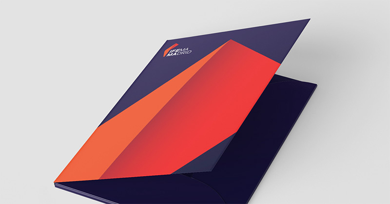
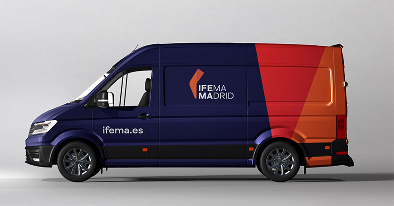
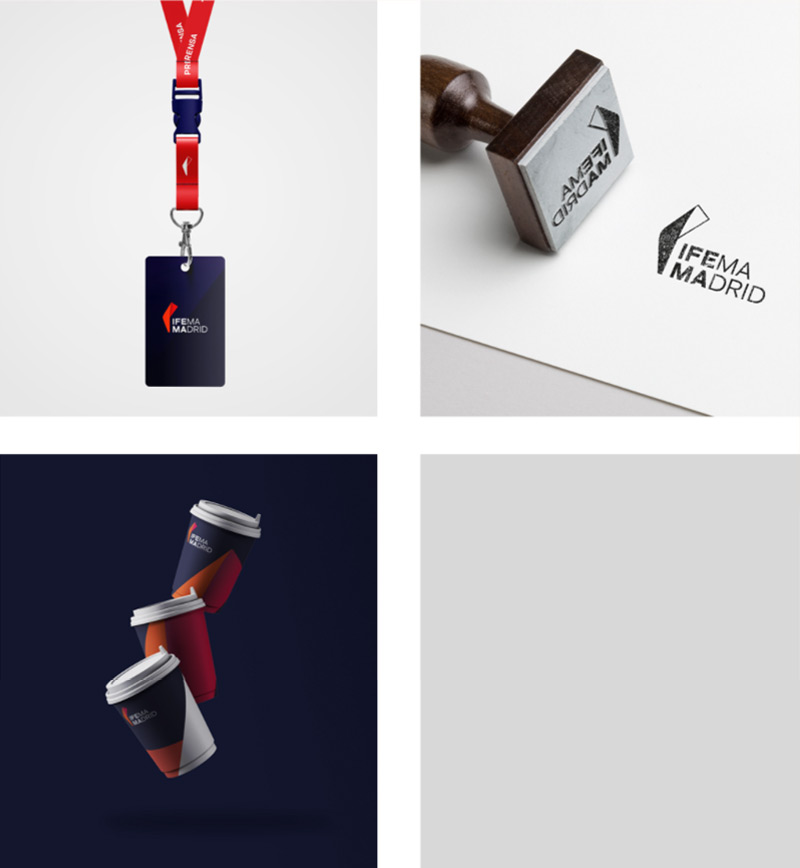
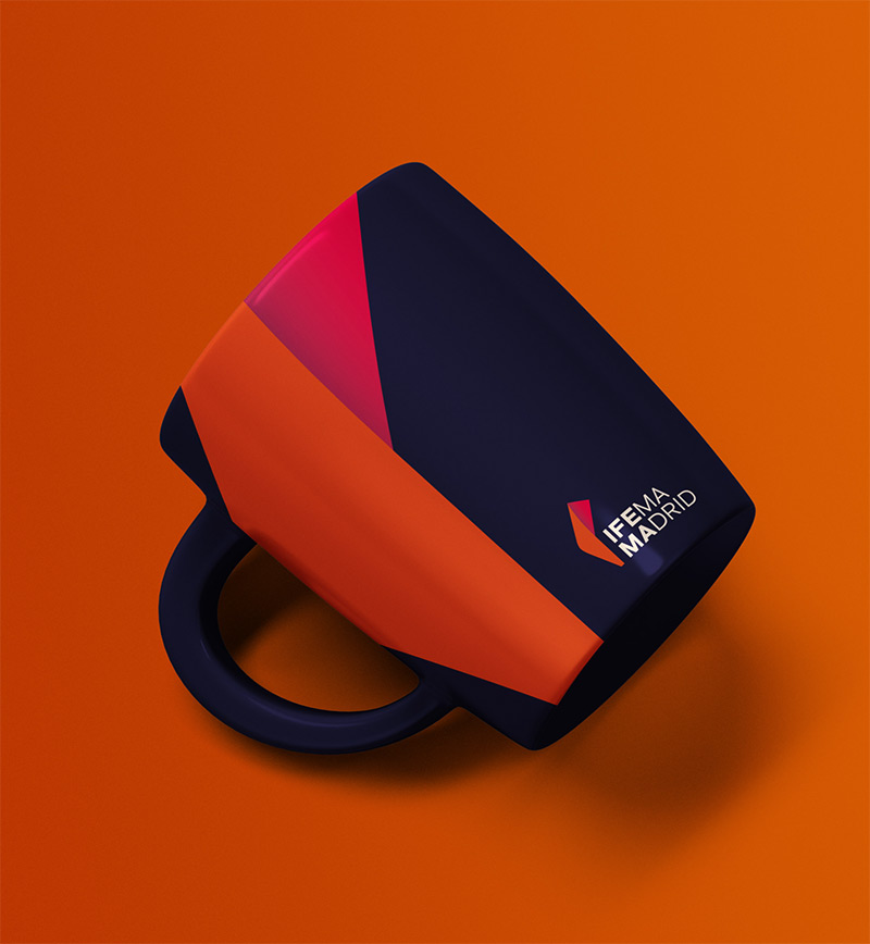
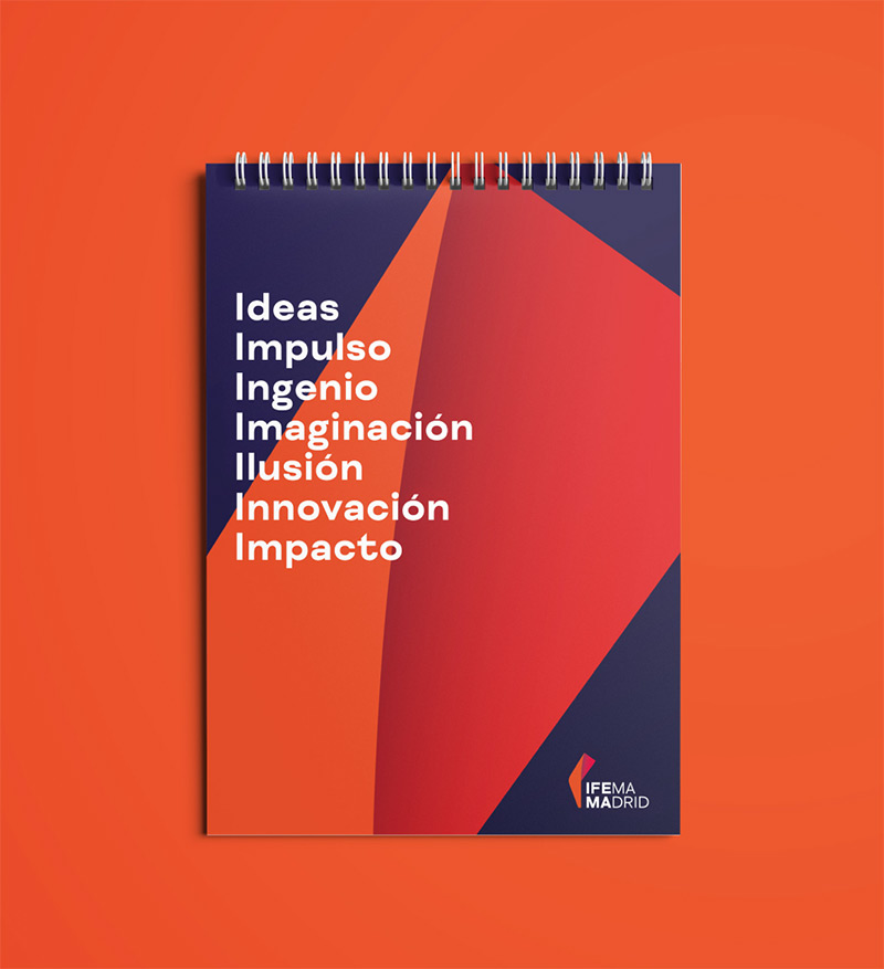
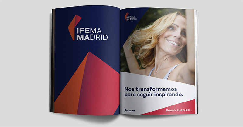
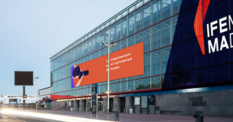
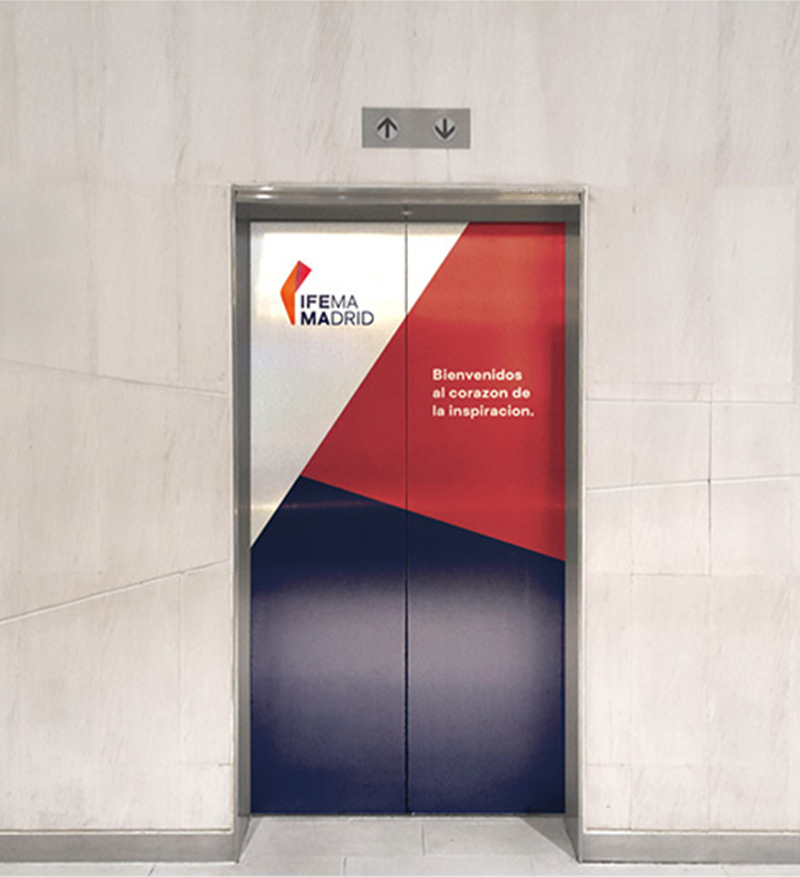


Graphical material available
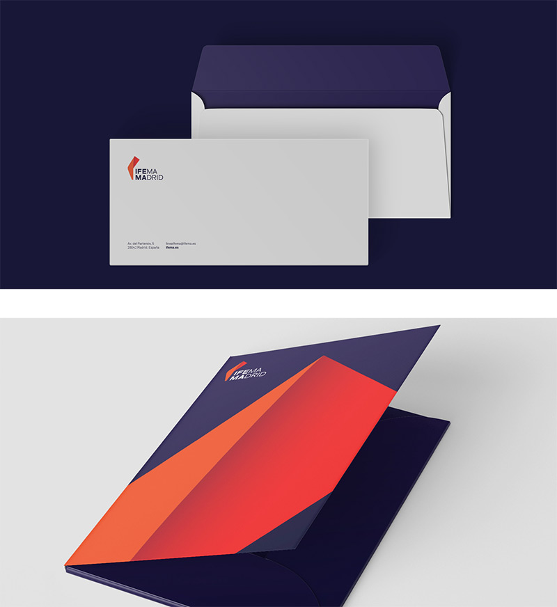
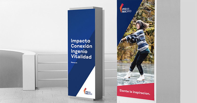
The brand is the most representative element of IFEMA MADRID and must be used according to the correct parameters and rules of its use established in the identity manual. From here you can download the brand in its different formats and colours.


