

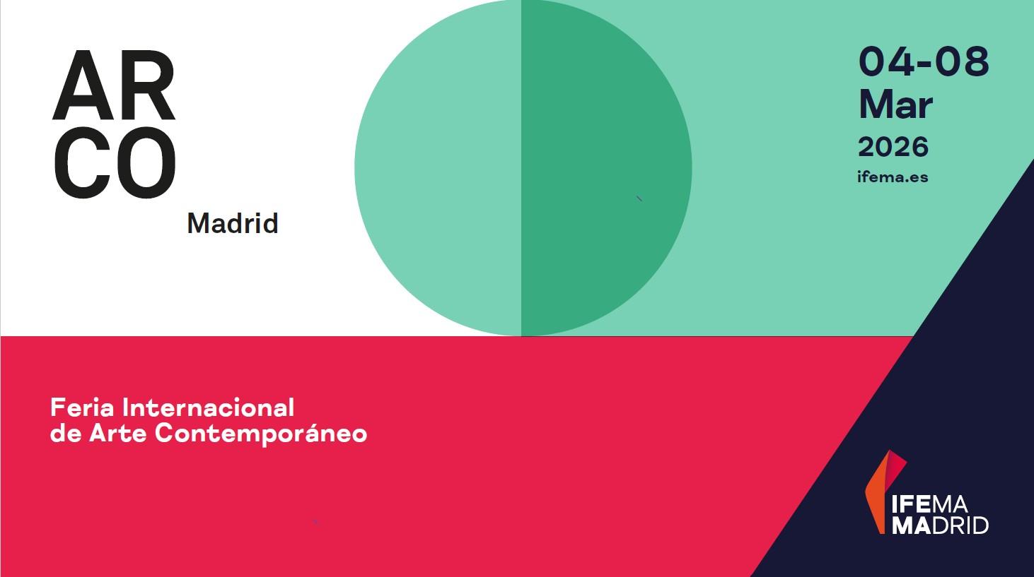
ARCO unveils its colour and new visual identity for 2026


Colour has always been a cornerstone of ARCO’s visual identity—not only through the exhibited artworks, but also as a key element in its graphic communication.
Since its first edition in 1982, when the fair embraced primary colours, through to the development of a chromatic code that unites the Madrid and Lisbon editions, colour has told the story of ARCO and its cultural connections.
ARCO 2026 - #338 C
The green and geometric forms that define ARCO 2026 are more than just graphic elements: they are symbols of art in motion, of global connections forged through artistic language. This new visual identity bridges ARCO’s heritage with its future, celebrating the diversity, research, and creativity that make the fair an international benchmark.
Green is the colour of nature, plants, and life itself. In a global context where the natural environment is increasingly under threat, green has become the "new gold": an essential, vital, and scarce resource. Beyond its aesthetic appeal, it reminds us of the urgency to protect what protects us. Caring for green is caring for the future.
This vibrant green adopted by ARCO for 2026 is, therefore, a symbol of hope and shared responsibility—an invitation to value and preserve the natural and social wealth that nourishes, connects, and inspires us.
ARCO 2026 arrives with a new image, yet remains true to its core principles: artistic quality, research and innovation in contemporary art, and the socio-cultural value that since the beginning define the spirit of the fair.