


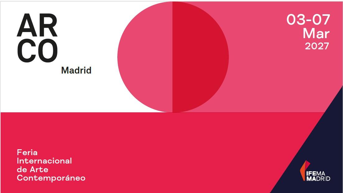
ARCO unveils its visual identity for 2027


ARCO has unveiled its visual identity for its 2027 edition
Both ARCOmadrid and ARCOlisboa will once again share a unified visual aesthetic through a new colour tone, further consolidating a key element of the fair’s identity: a shared visual language that connects the two cities and accompanies the content developed within each of their respective contexts.
The signature colour for the season is #E94871, a chromatic choice positioned between red and magenta, intense and luminous, which will serve as the unifying thread throughout the visual communication of ARCOmadrid and ARCOlisboa 2027: from signage, catalogues and tickets to the urban spaces that will infuse the host cities with energy and vitality.
ARCO 2027 – #E94871
#E94871 is a colour in motion. In Madrid, in March (3–7 March), it appears as a contained energy, linked to the cool light and subtle hues of the evening sky in a city transitioning between seasons. In Lisbon, in May (27–30 May), this same tone is transformed. The Atlantic light expands it, making it warmer and more atmospheric, in dialogue with the reflection of the sun on the Tagus River and the colours of traditional ceramic tiles.
#E94871 evokes the physical world: the body, fruits, flowers and minerals. In nature, colours within this spectrum emerge through processes of transformation: in the ripening of fruit, when pigments such as anthocyanins gradually replace chlorophyll; in flower petals, where they serve to attract pollinators; or through processes of oxidation and mineralisation. #E94871 embodies this active condition, one that is intrinsically linked to change and development.
ARCO 2027 introduces a new signature colour while remaining true to its core principles: artistic excellence, research and innovation in contemporary art, as well as the socio-cultural value that continues to define the spirit of the fair year after year.