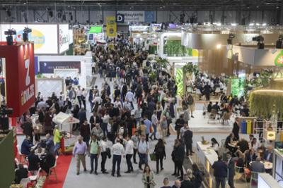
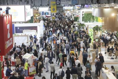
02/10/25 Fruit Attraction 2025 has generated 407 million euros and more than 3,000 jobs in Madrid, reaching record figures
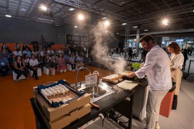
25/09/25 Fruit Attraction 2025 recognises innovation and entrepreneurship with the Innovation Hub Awards
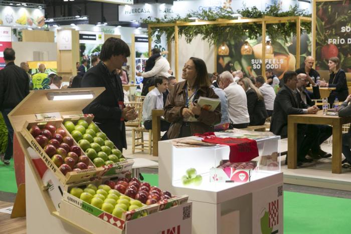
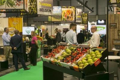
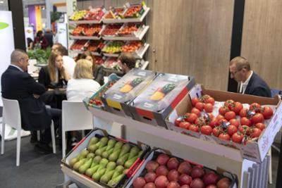
24/09/25 Fruit Attraction 2025 breaks record with biggest edition: up to 10% space and 8,4% exhibitors
16/07/25 Fruit Attraction 2025 takes a firm step forward and is to host the biggest edition in its history
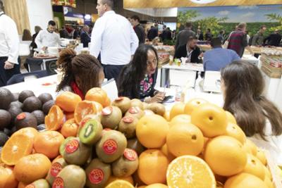
18/06/25 Fruit Attraction 2025 grows by 5% and expects to bring together more than 2,500 companies and 120,000 professionals
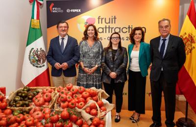
03/04/25 Fruit Attraction 2025 reaffirms its growth and leadership with a new distribution of halls and sectorisation