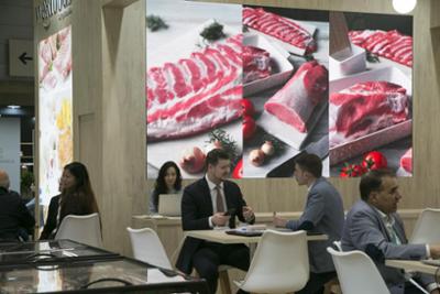
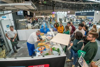
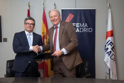
News header Mobile news header
11 January 2023

What the colour of your stand decoration says about you

Reading time
4 min.
News sections

When the eyes see colours, they trigger sensations in the brain that give a strong impression of a company's image.

The corporate image of your company, the style of your brand and the image of the people who work in your teams are facets of the personality you want to sell.

When you participate in an event, the colours you choose should create a certain mood, enhance your ability to attract the attention of trade fair visitors and make you stand out from the crowd.

 The colours you use to decorate your stand at a trade fair are something more; they are instruments that influence and change the mood of those working there, and of potential customers visiting the trade fair. If the overall look and feel of the website, stand decoration, shop or office décor, brochures and visual graphic identity put people in a better mood, they are more likely to bond with the brand and visit again. This means much more than just using the company's corporate colour.

It means understanding what the colours mean and using them to support your message through the elements that decorate your stand. The colours you choose have a noticeable effect on the decision-making process. Colour can be used to control the reaction of your audience while visiting your stand and to encourage certain behaviours. Here is a guide to the most commonly used colours and their impact on visitors to your stand.

Light and warm tones

Beige, yellow, orange, pink, red and the like. These are bright, active colours that appear pleasant and can provoke feelings of courage and energy. Light and warm colours make spaces and stands appear larger, and can also appear more approachable. They are highly visible, so their use should be restricted when they are among paler colours.

Cool and light colours 

Lavender, silver and blue bring subtlety, beauty and freshness. These cool, bright colours look modern and professional when combined harmoniously with grey. This is a particularly pleasing scheme for business, trade and services, especially healthcare, cosmetics and medicine.

Dark and cool colours

Purple, blue, turquoise, green and navy give a sense of stability and quality. These shades are often combined as complementary colours. Although they are not flashy, they will highlight your content.

Cool, dark colours are often used in business to give a sense of ambition, and of workers with special characteristics for government services, science, the automotive industry and IT.

Dark and warm colours

Gold, purple and brown communicate tradition, luxury and relaxation. They are a wise choice for expensive and elegant designs that appeal to the young and wealthy. Mixed with cool colours, they look modern and innovative. They are perfect for brands in the world of finance, consulting, architecture and art.

Neutral colours

White, grey and black provide contrast and bring out other colours. They have no particular message on their own. Neutral colours emphasise their neighbouring tones and enhance the effect of other colours.

They are used everywhere, as they work well in a wide variety of applications. Black can be combined with bright colours, with white and with dark colours, because it is a classic, and creates almost universal combinations.

How to apply colours for your stand's decorative elements

A simple set of colours can communicate thoughts without words and make an impact on your audience. The choice of colours should be a clear reflection of your brand's mission that appeals to potential customers.

The relationship between colours is key to their impact. Sepia and reddish-brown colours are reminiscent of times gone by and tradition, combinations with navy blue appear dynamic, while black and white in equal doses have an intrinsic sense of depth.

Again, there are no perfect colour choices. Some are common, others less so. Warm colours call visitors to action, while cool tones have a calming and relaxing effect. A red mark on a light background is expressive, but if placed on a cold background it is much warmer. The greater the contrast, the more powerful the message. And surprisingly, many successful campaigns have broken the rules of colour, using contrasting colours to influence markets and set trends.